


We Ran an Accordion Test, and Here’s What We Found
When people discuss accordions in SEO, the conversation typically revolves around whether search engines can “see” the hidden content and if that impacts rankings. That debate often overlooks a larger point—how users experience the page.
Clicks are important, yes. But so is scrolling.
Getting someone to click into your site is only step one. Keeping them engaged—earning the scroll—is what signals to both users and search engines that your content is worth exploring. It’s a behavioral cue that says, “This is relevant. This is useful.”
As SEOs, how we choose to present information on a page plays a critical role in that. Whether something is buried inside an accordion, highlighted up top, or broken into bite-sized sections, those choices shape user behavior. User behavior shapes outcomes; think engagement, conversions, and yes, sometimes rankings, too.
Wait, rankings? Yes, we said it. According to Mike King’s analysis of the Google API documentation leak, Google tracks “long clicks,” which is where users spend more time on a result during a session. That’s functionally similar to dwell time. If users quickly leave your page or bounce back to search, it can send negative signals. But if they stay, scroll, engage, and don’t return to search? That’s a behavioral green flag.
That’s what led us to test how opening a high-interest accordion section by default would impact behavior. Not to “win” the accordion argument, but to reduce friction, help users get to the content they care about faster, and create a better experience.
Here’s what we found.
The Page
During our analysis of user behavior for one local client, we noticed that an informational page outlining various service details used accordion sections to organize the content. While this layout helped keep the page visually tidy, it required users to actively click to reveal each section.
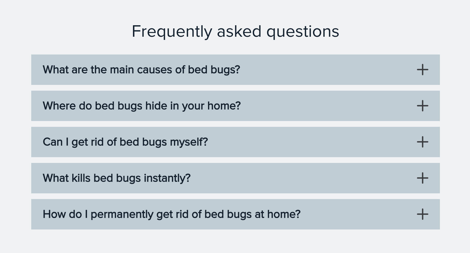
What stood out was that one specific service—not the first one listed—consistently received the majority of clicks across all devices. It was clear that users were especially interested in learning more about this particular offering, and they were willing to take the extra step to open that section to find it.
This behavior presented an opportunity: what if we reduced the friction by surfacing that high-interest content upfront?
The Hypothesis
If we automatically open the most-clicked accordion section, then, users will:
- Experience less friction
- Stay engaged longer
- Be more likely to take the next step (scroll, navigate, or convert)
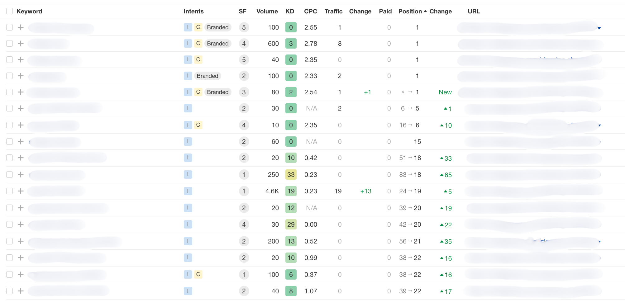
What the Data Showed
We implemented this change on September 24, 2024, and compared performance to the prior six-week period. The results are anonymized but reflect behavior on a service detail page with moderate traffic volume.
| Metric | Before | After |
| Pages per Session | 1.74 | 1.62 |
| Scroll Depth | 52.59% | 60.33% |
| Time on Page | 2 minutes | 1.6 minutes |
| Dead Clicks | 9.26% | 6.97% |
| Quick Backs | 15.79% | 13.22% |
After implementing the change, we saw clear signs of improved user experience. Scroll depth increased by 14.71%, showing that users were actually seeing more of the content. We weren’t forcing an engagement by only having users click to see one part of the information at a time.
At the same time, dead clicks dropped from 9.26% to 6.97%, meaning a smoother experience with fewer user interactions on non-functional elements. Less clicks to parts of the accordion that don’t cause an action (open/close).
We also saw a decline in quick backs, from 15.79% to 13.22%. Microsoft Clarity defines quick backs as users returning to the previous page in less time than a defined threshold, basically, a short dwell time. That short dwell can be a signal that the user didn’t find what they were looking for. This points to better initial engagement, users were more likely to stay and explore rather than bounce away.
While the average time on page decreased slightly, from 2 minutes to 1.6 minutes, we see this as a positive signal. Users found what they needed faster, with less friction. We also saw a small decrease in pages per session and more clicks to a CTA on the page.
The decrease in pages per session isn’t a bad thing; it suggests that the page more effectively satisfies user intent by reducing the need to navigate elsewhere. When we examine the clicks on the page, we see that this data supports that idea.
While we can’t show the heatmaps comparison screenshot from Microsoft Clarity, we can summarize what we saw. When the accordions were on the page, most clicks were to open parts of it, clicks on the bullet points hidden in the accordion, or misclicks/clicks to non-functional elements.
After we removed the accordion, clicks were going to the CTA on the page, and the services link in the menu. So, we saw:
- More people scrolling through the content
- Fewer people navigating back to where they came from
- Fewer people clicking on non-functional elements
- More people clicking on the page’s CTA and navigating to the general services page
But What About Time on Page?
While we brought up long clicks earlier, you might be wondering, how does that square with our decreased time on page?
Although the average time on page dropped slightly, we also observed a decrease in quick backs. That tells us users weren’t bouncing because the content failed to meet their needs. Instead, they were finding what they came for faster and continuing deeper into the site.
So, we didn’t lose quality engagement. We made the path to value more efficient. And in doing so, we likely improved our “long click” behavior as well: users clicked and engaged meaningfully and didn’t return to search or whatever page they were on before.
CTA Clicks
Using Microsoft Clarity’s Smart Events, we were able to track clicks to our CTAs. After removing the accordion, sessions where users clicked the “Request quote” button increased by 66.7%.
Bonus Insight: Rankings Improved Too
This wasn’t a ranking-focused test, but we still observed improvements. These increases were not normal given that we were focusing on location pages, other parts of the site that did not have to do with this page. However, these increases align with what we’ve seen across other projects: when you improve user experience, search engines often reward that behavior indirectly.
Pages that better meet user intent not only reduce friction, they increase engagement and earn trust.
Clearly, some of these rankings are small potatoes. No one cares about position 18 and that’s fine. We are simply showing that a small change where we didn’t even add or remove content or do anything to metadata was enough to move the needle. It’s a new starting point for more improvements to be made.
Final Thoughts
This accordion test reinforced a key principle: how you present content matters just as much as what you present.
User signals aren’t just nice-to-haves. They’re measurable indicators of page performance that shape the user journey. If your data shows a particular section consistently drawing attention, don’t bury it behind a click. Test making it more visible. Pair it with a CTA. Measure the change.
Remember, you don’t just want to earn the click. You want to earn the scroll.
Disclaimer: Results may vary. As always, you should run your own tests and see what you find.