


B2B UX Test: Simple Layout & CTA Tweaks, Big Gains
When a website’s design feels “off,” it is rarely just an aesthetic problem. It is a user experience problem hiding in plain sight. Visitors may be missing critical information, overlooking calls to action, or simply giving up before they find what they need. For one B2B company, we had a hunch that a few small but targeted changes could make a big difference in how people interacted with their site. Instead of jumping straight into a redesign, we decided to test first.
Using months of behavioral data from Microsoft Clarity, we identified high-traffic pages where layout and CTA placement could be improved. We then conducted a six-week test to determine if rethinking content order, button placement, and form design could enhance engagement and ultimately drive more conversions.
The Hypothesis & Changes
Our analysis pointed to a clear theme: important content and calls-to-action were either hidden too far down the page or competing with visual elements that distracted visitors. Making this information more visible and easier to act on would keep users engaged longer and encourage them to take the next step.
To test this, we focused on three key areas:
- Content hierarchy: On the core service page, we moved key benefit sections higher, placing supporting details further down.
- Quick navigation: On the homepage, we added above-the-fold CTAs for Careers and About, two of the most-clicked destinations from navigation menus.
- Form accessibility: On the Contact page, we removed a large, non-clickable logo above the form to reduce friction and keep attention on the desired action.
We also implemented two site-wide changes: replacing the bottom-bar email signup CTA with a contact button and reducing the height of the hero image on desktop so that content appeared faster without requiring scrolling.

(what the CTA bar looked like before our changes)
What the Data Showed for Our Test Pages
Core Service Page
The core product page experienced a significant increase in engagement after we revised the content.
- Scroll depth increased from 35.64% to 50.15%
- Pages per session went up from 1.48 to 1.83
- Time on page stayed steady at around 1.1 minutes
Reordering the page to surface benefits and key capabilities earlier gave visitors immediate clarity on value. That reduced early exits and nudged people to related resources, which explains the higher pages per session. The steady time on the page suggests that users were finding the right information faster and then moving to the next step, rather than lingering without direction.
Homepage
The homepage changes helped streamline navigation without creating confusion.
- Scroll depth increased from 43.97% to 45.32%
- Pages per session went from 2.30 to 2.14
- Time on page decreased from 1.8 to 1.6 minutes
Adding above-the-fold CTAs for the Careers page and the About page shortened the path to popular destinations. The slight increase in scroll depth indicates that users still scanned a bit more, but the dip in pages per session and time aligns with getting visitors to their target pages faster with fewer detours.
Contact Page
The Contact page benefited the most from the updates, which focused on reducing visual distractions and improving form visibility.
- Scroll depth increased from 60.94% to 65.68%
- Pages per session went up from 1.64 to 3.08
- Time on page increased from 1.2 to 2.2 minutes
Removing the large non-clickable logo put the form front and center, which encouraged more focused interaction. The higher time on page reflects users actively completing fields, and the jump in pages per session indicates visitors were also exploring nearby content before or after starting the form.
The sitewide swap of the bottom-bar email signup for a contact button likely sent more qualified visitors to this page, contributing to the lift in engagement here.
Conversions
During this test, we replaced the site’s bottom-bar email signup CTA with a direct contact button. This change aimed to encourage more meaningful user actions by connecting visitors directly to the primary conversion point, rather than relying on a passive subscription.
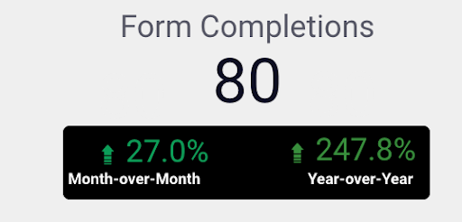
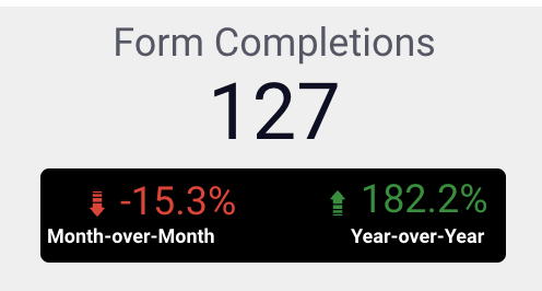
- Overall site conversions increased by 58.75% during the six-week test period
While this is a significant improvement, we recognize that it is correlative, not definitive. Three different pages were updated simultaneously, along with the sitewide CTA change, so we cannot attribute the increase to a single change with certainty.
What we can say is that the combined set of updates made it easier for users to find and act on high-intent actions, and these changes coincided with a notable boost in conversions.
How Small B2B Website Changes Delivered Big Results
This test demonstrated how targeted adjustments to page layout and CTA placement can enhance the way visitors interact with a site. By moving important content higher, streamlining navigation, and removing distractions on high-intent pages, we made it easier for users to find what they needed and take action.
Results showed stronger engagement on all three tested pages, with a notable increase in conversions. While we can’t attribute the 58.75% increase in conversions to any single change, the combined impact of these updates moved the needle.
For this B2B company, the takeaway is clear: thoughtful, data-backed design decisions tested on a small scale can pave the way for broader improvements with measurable business results.
Want to see how SEO testing can move the needle?
Schedule a discovery call with RicketyRoo
to start testing smarter and making data-backed SEO decisions.