


Testing Before Scaling: A Location Page Redesign That Delivered
Rolling out a change to every page on a site without testing is like buying a trailer without checking the hitch, you might regret it halfway down the road. We wanted to be sure our updates would improve the user experience, so we started with one of the busiest location pages for a trailer sales and rental business. It had the traffic we needed to see results quickly, and if the changes worked here, we knew they’d work everywhere.
The Page
For this project, we worked with a trailer sales and rental business that operates multiple locations across the United States. One of those location pages consistently ranked among the top five most visited pages on the entire site, and it was by far the most visited location page.
That made it the perfect testing ground. Any changes here would provide us with enough traffic and user behavior data to quickly determine whether we are moving in the right direction before considering a sitewide rollout.
The Hypothesis
When we reviewed user behavior data for this page, a couple of things stood out:
- Visitors often clicked on the address text, even though it wasn’t linked to anything
- A significant drop-off in scroll depth after 20% on mobile
- Trailer content and offer links were too far down on the page, making them harder to find
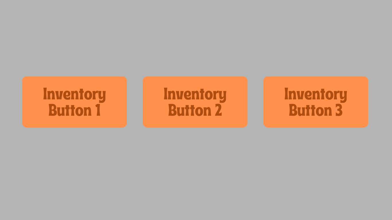
After these buttons, there were sections of content about each trailer type with a button to that page. No one was reaching this content, and people used the first inventory button to navigate or the navigation to get to where they wanted to go. This page missed out on the opportunity to send users to location-specific inventory pages because of this layout.
Our thinking was simple:
- Make the address clickable so people can easily get directions to the location
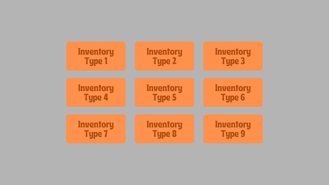
- Consolidate the inventory links and trailer content into one organized section so visitors can find what they need faster
We ended up making the organized section look something like this:
If we were right, we’d see more clicks to the location-specific trailers, less friction for users, and hopefully a boost in conversions.
What the Data Showed (Test Page)
After launching the changes, the results were clear:
- Sessions increased by over 2,000%
- Pages per session rose by nearly 27%
- Scroll depth improved by 3.95%
- Time spent decreased by 14.29%
The increase in pages per session indicates that we were successfully guiding users deeper into the site, helping them progress toward trailers, rentals, or contact information. That also explains why time spent on the page decreased. Visitors were finding the right information faster and moving on to the next step in their journey, which is precisely what we wanted.
One of the biggest wins came from making the address clickable. In the four weeks after implementation, we saw 21 clicks to the address, compared to dead clicks before. Since the purpose of this page is to help people reach the physical location or specific product they are looking for, that’s a direct indication that the change was successful.
With that kind of improvement in both engagement, it was an easy decision to roll these changes to the rest of the location pages.
Rolling It Out Across All Location Pages
The test had done its job. We’d proven that the changes improved user engagement and made it easier for visitors to act.
We implemented the changes across all locations in early 2025, knowing that this update directly addressed key user frustrations we had observed in session recordings and heatmaps.
What the Data Showed for All Location Pages
When we compared the four weeks before and after the rollout across all location pages, we saw:
- Sessions increased by 3.48%
- Pages per session rose by 2.3%
- Scroll depth decreased by 0.3%
- Time spent stayed the same at 2 minutes on average
While the lifts here aren’t as dramatic as the single-page test, they’re still meaningful, especially considering the broader site was experiencing an overall decline in traffic during the same period.
The increase in pages per session indicates that the streamlined layout was not only effective on the original test page, but also helped guide users deeper into the site across all locations. The stable time spent metric tells us visitors were able to find and act on the information they needed without unnecessary friction. At the same time, the minor dip in scroll depth suggests that the reorganized content made it easier for them to reach their next step without excessive scrolling.
In other words, these changes did exactly what we designed them to do: reduce effort, get visitors to the right place faster, and keep them engaged with the site.
Google Search Console Data
We also decided to examine GSC data for this test, as it was a group test with more data to analyze.
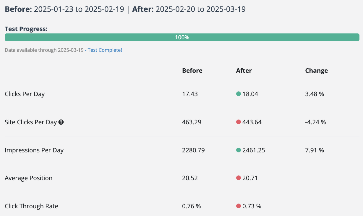
- Clicks per day saw a 3.48% lift
- Impressions per day saw a 7.91% lift
- Average position shifted from 20.52 to 20.71
- Click-through rate dipped slightly from 0.76% to 0.73%
The slight drop in CTR and position is consistent with these pages appearing for a broader range of queries after the changes. While they may be ranking for more diverse search terms, the trade-off is increased overall visibility, as seen in the higher impressions.
When examining conversions during this period, Request quotes saw a 12.15% increase, rental inquiries increased by 1, and phone calls increased by 16.31%.

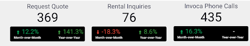
We recognize that this does not necessarily mean our test definitively caused the increase in conversions. It is purely correlative, but a notable finding to see that our group test had an increase in clicks and engagement, and we also saw conversions rise during a time when site clicks were down.
Turning a Small Test Into a Big Win
By starting with the most popular location page, we were able to validate our changes quickly and with confidence. That single test led to measurable improvements across the entire subfolder, boosting engagement and increasing visibility. We also saw conversions improve during the testing period.
It’s a simple formula: test first, measure impact, then scale what works.
Here, the data made the decision easy.
Want to see how SEO testing can move the needle?
Schedule a discovery call with RicketyRoo
to start testing smarter and making data-backed SEO decisions.