


What SXO Testing Has Taught Us
Search Experience Optimization (SXO) blends SEO and user experience (UX) to create a site that not only ranks well but also converts visitors into customers. Through multiple SXO tests, we’ve identified common mistakes that impact user engagement, conversions, and overall site performance. Here’s what we’ve learned from real-world testing.
What is SXO Testing?
SXO testing involves analyzing how users interact with a website and making data-driven changes to improve engagement, navigation, and conversions. Unlike traditional SEO, which focuses primarily on search rankings, SXO testing ensures that once visitors land on a page, they have a smooth experience that encourages them to take action.
Using tools like Microsoft Clarity and Google Analytics, SXO testing tracks user behavior through heatmaps, session recordings, dead clicks, scroll depth, and quick backs. By studying this data, we can identify issues such as poor CTA placement, oversized images, and navigation confusion. After implementing changes, we measure the impact on metrics like time on page, click-through rates, and conversions to determine what works best.
Hero Images: Bigger Isn’t Always Better
A common issue we see in SXO testing is oversized hero images. While large, high-quality visuals can be engaging, they often push important content and calls-to-action (CTAs) too far down the page.
One test for a trailer sales company revealed a major issue on their inventory page. The hero image took up the entire above-the-fold space, forcing users to scroll before they could see any available trailers. This was frustrating for visitors who clicked on the page expecting to immediately browse the inventory, only to be met with an irrelevant image upon loading.
By removing the hero image entirely, we saw a dramatic improvement in engagement:
-
Pages Per Session: +81.39%
-
Scroll Depth: +18.62%
-
Time Spent on Page: +158.33%
Hero images should complement the user experience rather than act as a barrier to the content they are looking for. When designing pages, ensure that essential information is immediately visible, especially for high-intent pages like inventory, product, or service listings.
Removing unnecessary hero images that don’t contribute to the page can make it more functional. Or, testing different variations, like reducing image height or replacing a stock image with a relevant visual alongside actionable content, can help determine the best balance between aesthetics and usability.
Above the Fold Content: Too Much or Too Little
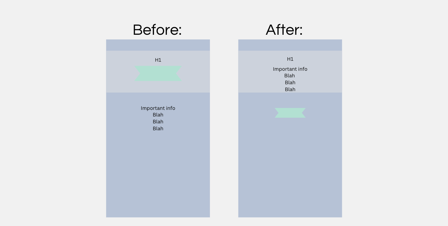
Another issue is either overwhelming users with too much information or providing too little context at the start of a page. Your above-the-fold content is where you are trying to earn the scroll and get users to engage with the content. With our hero image example above, the user landed on a high-intent page where they were looking for the inventory so they could navigate to exactly what they were looking for.
The site wasn’t using the above-the-fold space to its advantage and instead, deterred users from scrolling. You should make it as easy as possible for users to know that the information they want is on that page.
We ran a different test on a contact page, which had some written content and a giant map above the form. The written content included a paragraph about the company and a phone number and address, which weren’t clickable.
We removed the paragraph and made the address and phone number clickable. This is a contact page, so visitors who landed there were already convinced to reach out—they didn’t need a sales pitch before the form. We didn’t remove the map because of a page theme issue, however, just by completing these changes, we were able to see an increase in phone call conversions.
The phone number that we made clickable saw a 137.5% increase in phone call clicks. Those previous clicks were just dead clicks of users hoping to click to call, now with it being clear that the number was clickable we had more people try.
There is a phone call button in the navigation bar as well, which did see a bit of a decline in clicks now that we made the phone number clickable above the form. Overall, there was a 26.08% increase in total phone call clicks on the page.
Another example of changing above-the-fold content was for a music academy’s homepage. It had minimal content above the fold, mainly just a huge hero image. This page struggled to keep users engaged. We suggested adding an “Our Programs” button directly under the H1 and subheading to help direct users to relevant sections.
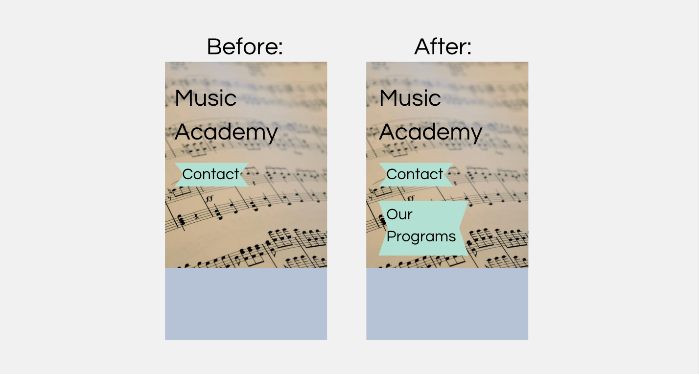
This new button became the third most clicked element on the page, and we tracked users’ journeys after clicking on this button as well. Since it was directing users to the programs offered, we saw an increase in clicks on that page, as well as various programs offered. One program’s CTA button saw a 134.37% increase in clicks, and the clicks trickled down to the specific program pages as well. By adding one button above the fold on the homepage, we were able to help funnel more users down the buyer’s journey.
Finding the right balance between information and simplicity is key. Users should not have to sift through unnecessary content to find what they need or feel lost due to a lack of guidance. Reviewing heatmaps and scroll depth data can provide insight into whether users are engaging with or skipping the important information.
Calls-to-Action: Make Them Easy to Find
Many sites either lack clear CTAs or bury them in hard-to-find locations.
CTAs should be immediately noticeable and placed where users naturally expect them. Rather than relying on text links, which can be easily overlooked, buttons should stand out with clear wording and contrasting colors. Placement is equally important; CTAs should appear in multiple locations throughout the page to give users easy access without excessive scrolling. Regular testing can help determine the best positioning to maximize engagement.
As always, find out what works best for the specific site you’re working on. Use your user behavior data to find out what are the most popular areas on the page and see if those areas are doing their job of satisfying user intent and possibly leading them to where they would want to go next.
Images: Don’t Let Them Block Key Actions
Large images on mobile can be especially problematic, taking up the entire screen and forcing users to scroll before seeing useful content.
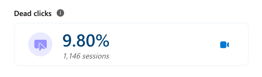
One test on a water heater service page showed that a large plumber image was forcing users to scroll excessively before seeing key content. By reducing the image size, we saw a noticeable shift in user behavior:
Before reducing the image size:
-
Pages Per Session: 1.76
-
Scroll Depth: 41.64%
-
Time Spent on Page: 1.4 min
-
Dead Clicks: 13.58%
-
Quick Backs: 6.04%
After reducing the image size:
-
Pages Per Session: 1.93
-
Scroll Depth: 41.01%
-
Time Spent on Page: 2 min
-
Dead Clicks: 0.00%
At first glance, the slight decrease in scroll depth might seem like a negative, but in reality, it meant that users didn’t need to scroll as much to find relevant content. More importantly, time spent on the page increased, and both dead clicks and quick backs decreased, signaling a better user experience.
Images should enhance the page, not create barriers. Oversized images can disrupt the flow of information. Optimizing image sizes ensures that users can access the content they came for without unnecessary scrolling or misclicks.
Confusing Elements: Clicks That Lead Nowhere
Dead clicks, where users tap an element expecting a response but get none, are a frequent issue. One example of this issue showed up on a home builder’s floorplans page.
User behavior data showed a significant increase in dead clicks and quick backs, a click that leads users away from the current page. The heatmap revealed that visitors were clicking on individual floor plan images, assuming they were interactive. When nothing happened, frustration set in, leading to increased exits from the page.
This insight led to a content strategy update. Since users expected to see more details about specific floor plans, the best solution was to create dedicated pages for each floor plan. This would provide additional photos, including images of completed builds, making the experience more intuitive and user-friendly.
Misleading elements like static images that appear clickable can create frustration and lost conversions. To fix this, websites should either make these elements interactive, linking them to relevant pages, or provide clear visual cues that indicate they are not clickable. Regular analysis of dead clicks and quick backs can uncover similar usability issues, allowing for improvements that align with user expectations.
Test, Learn, and Optimize
Small changes can make a big impact. Whether it’s shrinking hero images, refining CTA placement, or making sure users can actually click what they expect to, every tweak should be backed by data.
If your site isn’t converting like it should, start by analyzing user behavior; heatmaps, dead clicks, and scroll depth can uncover hidden roadblocks. From there, test, learn, and optimize to create a site that delivers the experience users expect.
Not sure where to start? Look at your high-intent pages and ask: Is the most important content immediately visible? Are users clicking where they should? If not, it’s time to test and make improvements.