

Summarize
What can you do for the client who has increasing organic traffic month over month and year over year? The clicks are coming in and people are checking out the content, but there’s a less than 1% conversion rate when it comes to form submissions.
This is what I wanted to figure out. I needed to see how we could get users to contact the client because the well-written content wasn’t enough. By installing Clarity to receive more data on how users interacted with my client’s site, I was able to recommend improvements that have continued to increase the client’s conversion rate.
Our Client
The client that we used for this test is in the home building industry. They have seen consistent gains in traffic YoY, but we haven’t been seeing the same growth for conversions. Over the last 6 months they have seen few form submissions and phone calls from organic traffic. It’s important to note that due to the state of the economy and high interest rates for homes, it does make sense that there aren’t tons of people who are interested right now.
They are a small site with a little over 100 URLs and 3-4,000 organic sessions per month. While we are working with a small dataset, we believe it’s important to test and see where it’s possible to improve for all types of clients. Small clients can benefit from increases in conversions, no matter how incremental they may be.
Clarity
Clarity connects with Google Analytics and provides session recordings, so we can see how long people are staying on the page. Heatmaps to show where people are tapping or scrolling and how far down they scroll on each page. This can let us know how users interact with our client’s content and lets us know what’s going on, what’s wrong, and where to change up the placement of things.
How We Did It
We installed Clarity on the site on April 7, 2023 and gathered 2 months worth of data. We used the following metrics, as well as watching session recordings and looking at heatmaps to come up with our recommendations.
Metrics
Sessions
This is the number of visits to your site during the selected period of time.
Scroll depth
This is how far users scroll down a page.
Pages Per Session
Pages per Session refers to a website’s total page views divided by the total number of sessions in a given period of time.
Time Spent
This is the average time spent in a session. We will look at active time, when a user’s attention was on the site.
Click interactions are marked as dead clicks when a user clicks on an element but gets no feedback in a reasonable amount of time. This click means that the visual status doesn’t change, and there’s no navigation away from the page. A dead click can signify broken elements, high latency requests, or misleading UX.
Clarity defines a “quick back” as a click that leads users away from the current page to another site. “The user doesn’t find the navigation useful and returns to the original page or website under a certain threshold of time.”
Form Completions
Form completions you receive from organic traffic.
Calls
Calls you receive from organic traffic.
Top Pages
We used the top four pages on the site to base our recommendations on. We looked at the homepage, their most popular blog post, the floorplans page, and a service page.
While watching recordings, we noticed that the pages loaded too slowly. When the pages load all we can see is the hero image. There was nothing above the fold on these pages that urged users to reach out or let them read the content, and forms were above the content on blog posts. There were also some text that was hard to read due to font color and placement.
Recommendations
After watching session recordings and looking at the metrics we defined earlier, we came up with the following recommendations:
- Decrease hero image size across the site
- All we can see is the hero image on both mobile and desktop. This needs to be fixed, so users can get to the information they are looking for easier.
- Remove hero image on blog posts
- There is already a featured image on these pages, so having the hero image is redundant and keeps users from getting to the text on the page quicker.
- Floor plans page updates:
- Add a call-to-action banner above the point where 50% of users reach while scrolling
- The majority of users (57.43%) scroll to the 12th floor plan on the page. This means that we should include a CTA banner or button to urge users to contact our client before then.
- Add a call-to-action banner above the point where 50% of users reach while scrolling
- Move the contact form below content on blog posts
- Currently, this shows up before the blog content on mobile and on the right-hand side of the content on desktop. Since users who are visiting the blog likely just want information vs submitting a contact form, we recommend moving the form below the content.
- Homepage updates:
- Change font from white to another color on hero image that is easily readable on homepage
- Decrease the size of the homepage hero image
- Replace “Watch The Video” button with “Contact (insert company)” and link to the contact page in the section of content below it
- Add some space between the header and the buttons, so they are easy to read
The Results
We implemented changes on June 8, 2023. Here is the data from before implementation vs after:
Month 1
We had 9 form submissions and 1 phone call.
Scroll Depth & Time on Page
Scroll depth slightly decreased for the master bedroom blog post, floor plans page, and the homepage. However, time on page increased on each of these pages. The scroll depth decreasing is not an issue and was to be expected after our June recommendations. We decided to make the hero images smaller on regular pages and to remove them from blog posts, so users can get to the information they are looking for easier. This decrease makes sense and shows that we are satisfying user intent a little bit better now. The time on page confirms that as well.
On the service page, we saw scroll depth and time on page increase. By fixing the hero image issue we were able to have the relevant information load before the fold. This has convinced users to stay on the page and to read more.
Dead Clicks & Click Backs
We did see an increase in dead clicks across the board, which means that we have elements on the page that users believe are clickable when they aren’t. After looking through session recordings and heatmaps, it seemed more like people were clicking quickly and misclicked because they were trying to get to a new page quickly. We see this as an opportunity to work on site speed, so users don’t feel the need to double-click to get to the next page faster.
The impact of our recommendations on the amount of quick backs varied. To reiterate, a clickback can mean that the user doesn’t find the navigation useful and returns to the original page or website under a certain threshold of time. The floor plans page, the homepage, and the service page all had an increase in clickbacks. The master bedroom blog post has fewer click backs.
We saw in our recordings that users were jumping around from page to page to just check out all the site’s information. The user wasn’t necessarily dissatisfied with the information or immediately received the information they needed and clicked out. Sometimes users just want to check out what information is available.
A lot of the clickback recordings are for sessions with longer session durations. There aren’t many examples of being on the page for 30 seconds and clicking out. A lot of the sessions are for 2+ minutes.
Month 2
We had 7 form submissions and 5 phone calls.
Scroll Depth & Time on Page
Scroll depth increased for the blog post, floorplans page, and the homepage. The blog post and homepage also saw an increase in time on page. This indicates that more people are looking through that page’s content and reading through it. Although the floorplans page saw an increase in scroll depth, it saw a small decrease in time on page. After looking through the page again ourselves, we realize that it could be because you have to scroll and view each floorplan one at a time. We might want to try a different layout to allow users to see more than one floorplan at a time to see how that affects these metrics. We decided to leave it as is to collect more data.
The service page saw a big decrease in scroll depth and time on page. We will continue to monitor this page and see if there is anything we can do to improve.
Dead Clicks & Click Backs
We did see a decrease in dead clicks and clickbacks across the board.
Month 3
We had 14 form submissions and 6 phone calls.
Scroll Depth & Time on Page
As we head into our third month after the test, the site has received more visits, but scroll depth slightly decreased while time on page remained stable. We watched session recordings which affirmed our suspicions that we should make an effort to improve site speed.
Dead Clicks & Click Backs
We did see an increase in dead clicks and clickbacks. We especially notice the uptick in dead clicks on the floorplans page. People think they can click into each floor plan and expect it to take them to another page.
We believe that we should create individual floorplan pages in the future so we can help users find what they are looking for.
Form Completions & Phone Calls
We looked at the past 6 months of conversions from organic traffic to compare to how the site is doing after our implementation.
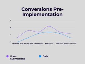
Form submissions and calls:
- December 2022 – 3 and 0 phone calls
- January 2023 – 8 and 3 phone calls
- February 2023 – 7 and 6 phone calls
- March 2023 – 11 and 7 phone calls
- April 2023 – 7 and 6 phone calls
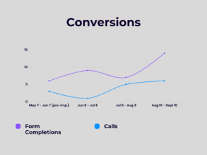
One month before implementation, from May 7 – June 7, we saw 6 form submissions and 3 phone calls.
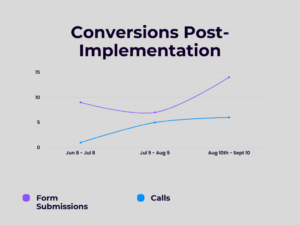
From June 8 – July 8, we saw 9 form submissions and 1 phone call.
From July 9 – August 9, we saw 7 form submissions and 5 phone calls.
From August 10th – September 10, 14 form submissions and 6 phone calls.
That is an overall 122.22% increase in conversions*!
*Both form submissions and phone calls counted. Based on conversions one month pre-implementation vs 3 months after implementation.
Final Thoughts
Although there are still areas for improvement on the site, we have noticed that making small UX/UI changes greatly increases conversions. It’s as simple as making a site as user-friendly as possible and reaping the benefits once it’s done.
Even small businesses can benefit greatly from testing and experimentation, and tools like Microsoft Clarity are free and easy to use. Don’t let the size of a site limit you.
Ready for crystal UX clarity?
Schedule a discovery call with RicketyRoo
and make improvements that move the needle.