

On April 21st of 2015, Google rolled out an update to their core algorithm. The purpose of the update was to boost the ranking of mobile-friendly pages on mobile search results. If your website is not mobile-friendly and ranks well organically, you can count on rankings to drop on mobile searches.
Why Bother Being Mobile Friendly
Shortly after Google rolled out this new update, they also announced that more searches are done via mobile than on desktop. This means that more people are searching and accessing search engines via mobile devices than traditional desktop and laptop computers.
Most business owners don’t think to look at how their website looks from a mobile device (I’m guilty myself).
Take a look now. Pull up your website from your smartphone and see how it looks.
Do you have to pinch and zoom to read the content?
Can you easily click on links to go to other pages on the site?
On a scale of 1-10, what would you rate your experience looking at it?
If it’s anything less than an honest 8, changes need to happen ASAP.
How To Look At Your Mobile Traffic Via Google Analytics
Curious to see how much of your current traffic is coming from mobile? If you have Google Analytics, follow these steps:
- Open a new tab in your browser, and go to google.com/analytics. Click on the Access Google Analytics button in the upper right-hand portion of the page.
- Sign in to access your Analytics account. Click on your business to get to reporting
- In the left hand navigation, click on the Audience Tab, it should drop down with a list of options.
- Click on the Mobile Link, then click on Overview
- View your results
As you can see from my results below, more than 29% of my traffic is coming from a mobile device or tablet.
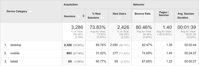
The average we see of our clients is between the 35-45% range. This number will only go up.
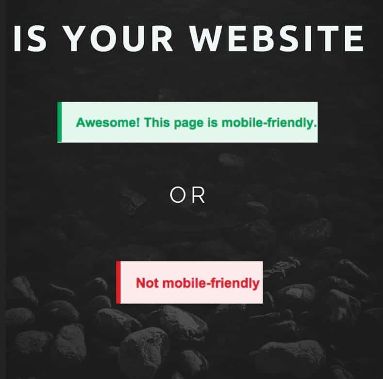
How To Test Your Site For Mobile Friendliness
Want to know if Google thinks your website is mobile-friendly? It’s free and takes less than one minute.
Visit Google Mobile-Friendly Test
After opening the link, enter the URL for your business.
View results.
If your website is mobile-friendly, pat yourself on the back! If you get the Not mobile-friendly result, keep reading.
If My Site Is Not Mobile Friendly, What Are My Options?
Their are 3 options:
Option 1: Don’t do anything
Pro: It’s free!
Cons: Missing out on admissions from mobile users. Loss of rankings on mobile search to mobile-friendly websites.
Option 2: Have a mobile version of your website
Pros: Relatively affordable. Get’s your website mobile-friendly
Cons: Band-aid fix. Google prefers responsive design
Option 3: Responsive website redesign
Pros: Google’s preferred method. No separate website for mobile users. Deliver a seamless experience across all devices.
Cons: Cost of new site
If your website is mobile-friendly and you are happy with how it looks. More power to you and keep on trudging the road to Happy Destiny!